
Calm is the defining word of 2026. With all of the exterior chaos, interiors are turning minimal, earthy and nostalgic to transport people back to simpler times.
Victoria Yardley, Founder of eco paint brand Victory Colours, says: “After several years of global and economic uncertainty, people are craving homes that feel grounding and reassuring. In 2026, colour is being used as a form of emotional support, to create spaces that lift the mood and make everyday life feel a little more balanced.”
Read Victoria’s list of popular warm paint colours that will help you to make your home a sanctuary.
Terracotta: The Boho Home’s Red

If you’re in with the times (or chronically online), you know that every home needs a little bit of red, according to TikTok red theory. For some, red can be a little garish, especially if your home is botanical or coastal leaning.
Terracotta is the best way to add that fiery hue to your home without feeling inauthentic or doing something that is in trend but out of character. According to Victoria, paprika-like tones “add a gentle sense of vitality”. It’s a far more subtle and warm take on the trend that complements a muted, biophilic style.
Soft, Warm Blues

Vintage denim blue and navy or indigo with warm grey undertones give it an old-world feel that sharp, contemporary blues don’t.
“These blues feel sophisticated and calming and work beautifully with brass and natural materials, creating spaces that feel both elegant and relaxed,” she adds. From the Victory Colours collection, she suggests Etruscan Grey, 126 mph and Boscastle Blue from the Victory Colours collection.
Stark Neutrals Are Out

“The neutrals of 2026 are warmer and more characterful,” Victoria says. “They feel grounding and comforting without the flatness of traditional magnolia.”
There’s a reason that Pantone crowned a warm white its Colour of The Year. “People want spaces that feel safe, comforting and quietly joyful,” Victoria explains. “Colour in 2026 is about individuality and warmth, creating homes that soften the world, not compete with it.”
Buttery yellow shades are the perfect gateway into warm interiors. For lovers of cream and beige who want to venture into colour, butter yellow is a safe choice that pairs incredibly well with biophilic and neutral decor.
Speaking of Biophilia…

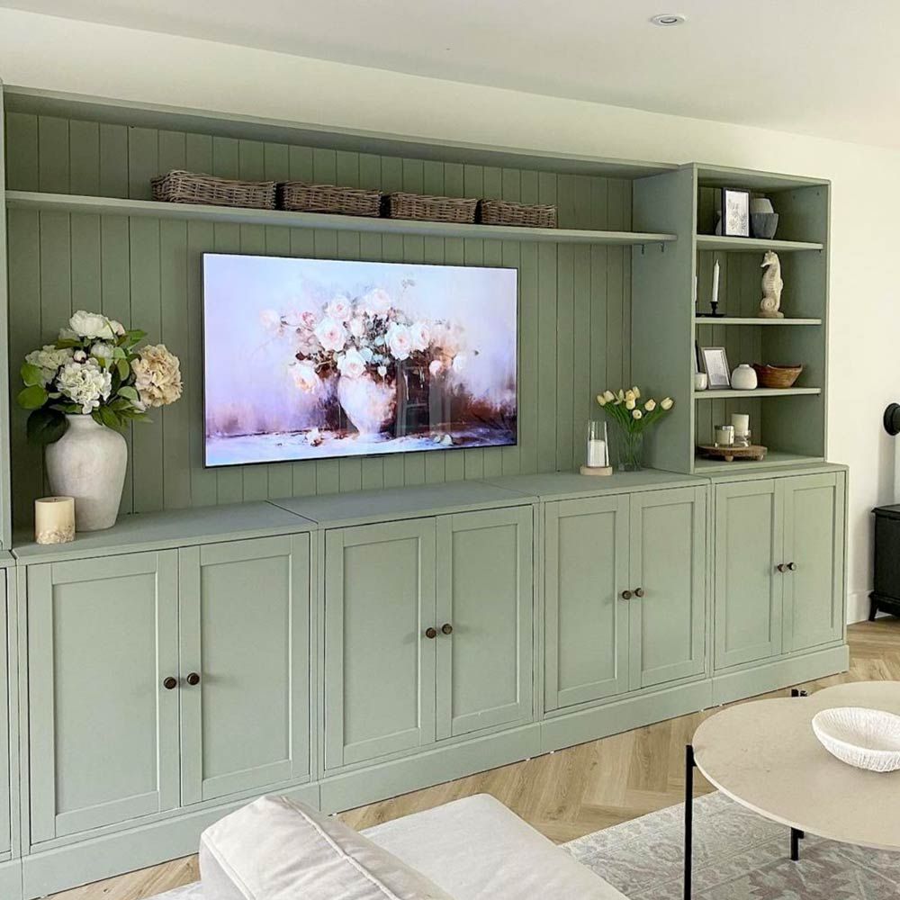
As you know, natural elements are essential for balance and wellness in the home. There are ways to achieve the look without becoming a plant parent. Shades of green inspired by forests, gardens and landscapes are the perfect colours for painting your home if you want that biophilic charm with minimal cost.
Victoria says: “Green is incredibly powerful psychologically and will bring an instant sense of calm and connection to nature, helping spaces feel restorative rather than overstimulating.”
Victory Colours’ range of eco-friendly, vegan paint is available online now, priced at £44.95 for 2.5-litres of matt emulsion.


Leave a Reply