While calm is the goal for 2026, that doesn’t mean we won’t see daring pops of colour. Red arrived on the scene last year and is still on the rise with no sign of going away into 2026. So how does one style it?
Amthal Karim, Head of Design at Furniture And Choice, shares her tips for styling your home with shades of red this year.
“Red as a colour trend is growing,” she says, “and we predict it will continue to gain momentum as the year progresses. For anyone who wants to make a bold start to the year, this is the trend for you.”
Why Is Red So Alluring?

“The psychology of red differs depending on the context,” Amthal explains. “Often associated with passion, romance, and excitement, it can also convey feelings of danger or anger, like the term ‘seeing red’. When it comes to interiors, it’s not just timeless but also incredibly versatile. It can be used to warm up the living room, make the dining room feel more intimate or inject passion into the bedroom.”
Red has certainly made its way back into our minds through culture, with set design and costumes on screen such as the colourways in the latest film adaptation of Wuthering Heights. Despite “boyfriends are embarrassing” rhetoric capturing our culture, we’re more desperate for passion and strong emotion than ever—we’re reflecting this in our home design choices too.
Another cause of the red renaissance is TikTok’s “unexpected red theory”, which Amthal found to have come at the time of red’s spike in popularity. “The trend,” she says, “which originated from TikTok, involves adding a hint of red to enhance the room’s appearance. This can be through accessories like a red cushion on a neutral-coloured sofa or by introducing a red lamp to a neutral space.”
Red Decor Tips For 2026

“Red’s fiery and bold presence allows it to complement or contrast different textures,” Amthal explains. “Velvet or plush fabric upholstery, wall panelling, textured wallpaper, and lacquered tiling are many ways red textures can be introduced into your home. Meanwhile, metallic textures like vases, lamps or coffee tables provide a stylish contrast and brighten up the room.”
One recent release which fits the bill for that pop of red is the Eileen square canvas print in Desenio’s new square canvas collection. Also available as a vertical rectangular portrait, the deep scarlet clothes contrast the neutral subject and background. This would be perfect for a neutral home looking to add that pop.
“Besides textures,” she continues, “mixing and matching red with other colours creates a layered look. Pairing red with earth tones like light brown wood tones, light greys and indoor greenery helps soften the room and create a calming anchor.”
How To Paint The Town Red

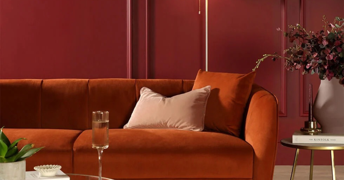
“For those who want to go all out with red on the walls, it’s about picking the right tone of red,” Amthal advises. “Terracotta trends quite highly on Google with 1,300 searches for the term ‘terracotta paint colour’. It’s a great choice if you want to inject an earthy touch into the room, thanks to its reddish-brown undertone. Oxblood with 2,400 searches is the red tone to inject passion, sophistication and warmth into the room. It works particularly well if you have wall-panelling as it highlights the depth of the walls. Burgundy, with 5,400 searches, has a cooler undertone compared to oxblood and is reminiscent of red wine.”
A personal favourite of mine is Farrow & Ball’s Preference Red, a deep berry red colour, which I have used in my own home to colour-drench my study. Not only does it create an intimate and warm space for reading; it’s a great place for rest, relaxation and deep conversation.
“The colour-drenching trend shows no signs of going away,” she adds, “and layering the room with different tones of red creates a chic and sophisticated look. Burgundy walls and a burnt orange sofa create a striking effect with their fiery spirit, which lights up the room.”



Leave a Reply