The worst thing a home can be is generic. With a tight budget and a dream, it can be hard to break out of the mediocre and curate a space that is unique but true to you.
A solution could be to visit flea markets and find that one-of-a-kind piece that works perfectly in your space. But what if you don’t have flea market money? And what if you like the art and decor that you currently have?
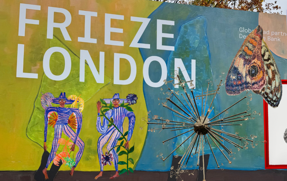
Luckily for you, we visited the Frieze London art fair this Frieze Week to study what makes for a stand-out home. Here are the 12 lessons we learned that cost you little to nothing.
Lesson 1: Your choice of paint colour should be more than an impulsive Pinterest find.


Although we’re drawn to trendy wall paint colours like wine reds and sage greens, these colours do more than look good for socials. The colour you choose will either highlight or camouflage elements of your design.
We saw this with Sarah Buckner’s work, which she chose to display on pastel sage-leaning-lime green walls. It made the muted yellow hues pop and gave a warm glow to her work that would otherwise lean cool.
On the other hand, Naudline Pierre’s art was displayed against a dark burgundy wall. This brought out the subtle pinks, reds and purples that would be otherwise hidden in her work.
Lesson 2: Don’t be afraid of a wonky frame.

Especially when dealing with abstract or minimalist art, furniture or decor, don’t be afraid to experiment with placement and do things that are unconventional. Antonio Pichillá’s work is a great example of this. The repeat pattern is used not only on a canvas but also across different media. You can use the placement to tell your guests something about yourself in the same way that artists use it to tell a story.
Lesson 3: Neutral minimalism requires depth.

If you’re afraid of your neutral minimalist home feeling like a West Elm or Ikea store, what you need is depth. This can be achieved through varying textures and tones of the same palette.
Edmund De Waal’s work fits the white wall behind it but you can’t help but zone in on the textural elements. The alabaster actually required more focus than the gold leaf. Likewise, use texture to elevate your home and make it stand out.
Lesson 4: Busy wallpaper can host art and decor.

People tend to shy away from putting art on walls that have a medium print wallpaper for fear that it will overwhelm. However, after seeing OMR’s display, I am convinced that it does the opposite.
Especially if minimalist or abstract, the art can calm down what feels like a busy wall by creating focal points. This might be the sign you needed to get that wallpaper on your wishlist.
Lesson 5: Sometimes, the dead space is the art.

Carlos Bunga’s work teaches us that the subject doesn’t have to occupy the whole frame. Sometimes, a small subject against a large backdrop is telling you about how small the subject is or feels or how vast the setting is. Likewise, treat your home in a way where not all dead space is an opportunity for more stuff. By doing this, you’ll find the furniture and decor you already have aren’t competing for attention.
Lesson 6: Art is a mirror but mirrors are also art.

Your art should reflect you as a person. So should how you display it. However, we fall short in this way—we pick a basic, often bevelled, rectangular mirror to hang up and look into everyday. When you look into a mirror, you are doing the terrifying thing of facing yourself. Why shouldn’t the details of such a powerful tool reflect who you are?
Monir Shahroudy Farmanfarmaian’s work is a great reminder of this truth. Try different shapes, get multiple mirrors, decorate with stickers and pictures and textures.
Lesson 7: The gallery wall lives on.


The gallery wall can never be overdone because every time it is done it is different. How a person in a loft studio apartment uses a gallery wall to add some visual interest to their kitchenette is different to how another uses a gallery wall as a lounge feature wall.
Rene Trevino and Edi Rama’s work is a prime example of this. Rene’s display draws your attention to a central piece whereas Edi’s gallery wall is kept uniform and minimal to highlight the art in the frames.
Lesson 8: Art is not confined to the walls.

Dominique Gonzalez-Foerster’s work extended beyond the typical viewing, part of his work being displayed as a rug. And a question occurred: why do we only see what’s on our walls and on plinths as art? Who decided that art was reserved for the vertical realm?
Therefore, let’s make a conscious effort to treat our rugs, beds and even fridges as art. There’s so much more we can be doing to personalise our space that doesn’t occupy space or eat into our budgets.
Lesson 9: Frames don’t have to be wood or metal toned.

Although this piece by Edgar Calel doesn’t have a range of colours, that vibrance, carried from the watermelon to the frame makes the art have much more impact, extending beyond the second dimension. The same can be applied with beds and chair legs and bases.
Lesson 10: Don’t put art in a box.


Need I elaborate? Not everything must be square or rectangular. This applies to art, but it also applies to homeware and decor that has standard shapes such as your glassware or your sofa.
Examples of this from Frieze are Studio Lenca and Julia Gutman‘s work.
Art is free. Therefore, it doesn’t have to obey the rules of any given domain. Treat your home as such.


Leave a Reply